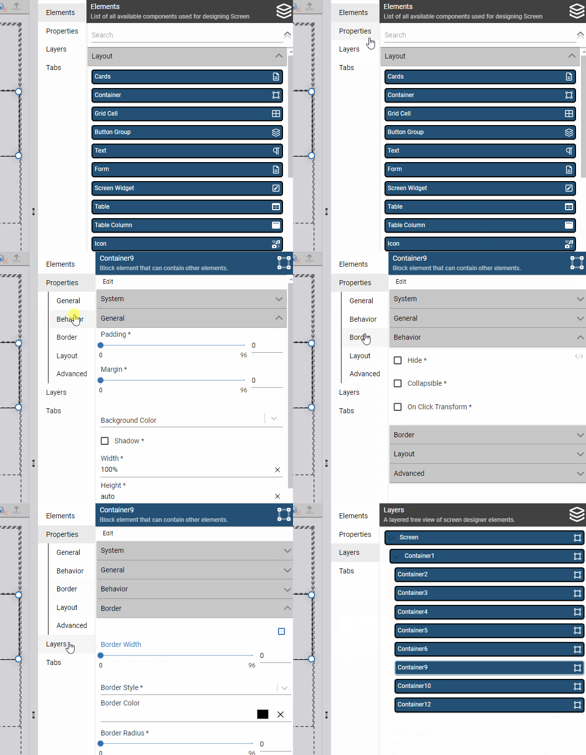
The 2024.3.0 release features a significant update to the way one of our flagship designers is laid out. With this release, the Screen Designer has been reorganized to group all "panel" elements into a consistent tabbed layout on the right-hand side of the screen. This means the Toolbox panel, previously located on the left side of the screen, is now found in the Elements tab in the right-hand panel. Panels with sect…
New panel navigation to access Screen Designer elements, properties, and other configuration
Screens and User Experience
New Button Elements
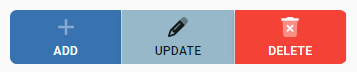
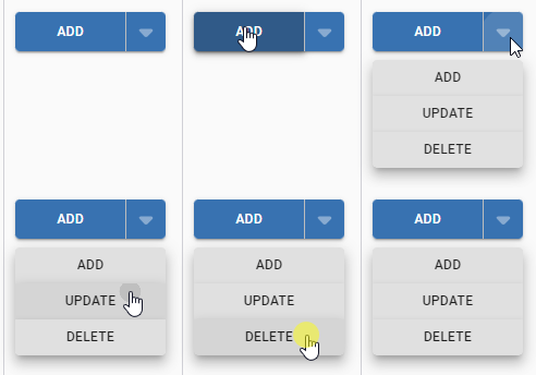
The March release includes two new button elements, supporting more complex arrangements of flow and action buttons in screens. The first of these is a new "Button Group" Layout element. The Button Group acts like a container, but only allows flow or action buttons to be placed inside it. These buttons will be visually grouped together on the screen, allowing related actions to be tied together to clarify the interfa…
Add, Update, and Delete buttons placed in a Button GroupAdd, Update, and Delete buttons placed in a Split Button
Screens and User Experience
Resizable Panel Element
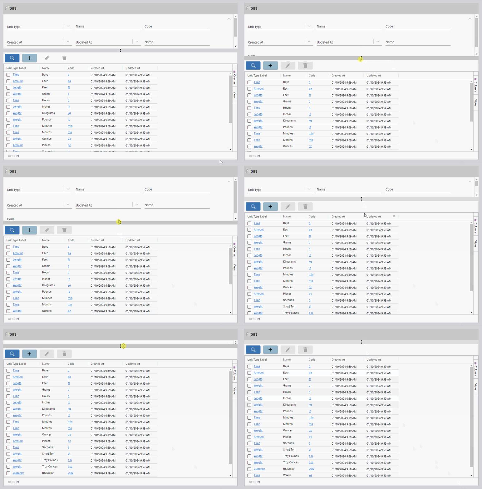
This month's release includes another new space-saving Layout element: a Resizable Panel. This element behaves very similarly to the panels in our own designers - in fact, it's the same underlying code! Resizable Panels allow screen designer users to drop in a container that can be resized by the end user to fit their needs, allowing those end users to decide how much or how little space to devote to the content. Thi…
Resizable Panel element used to make the filter section on a table screen resizable
Screens and User Experience
New Element Configuration Properties
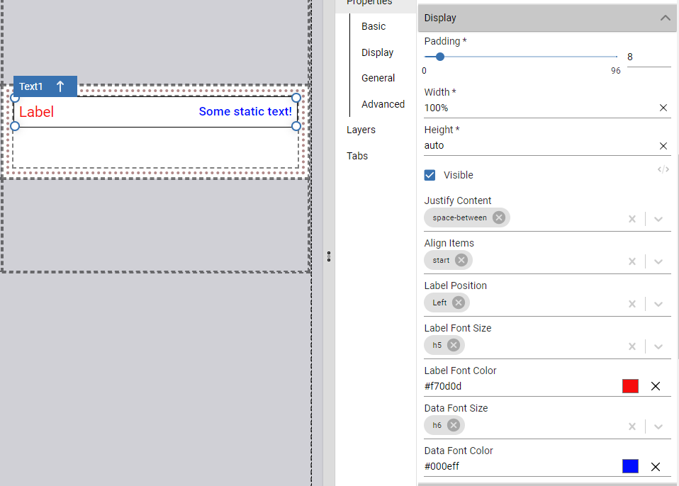
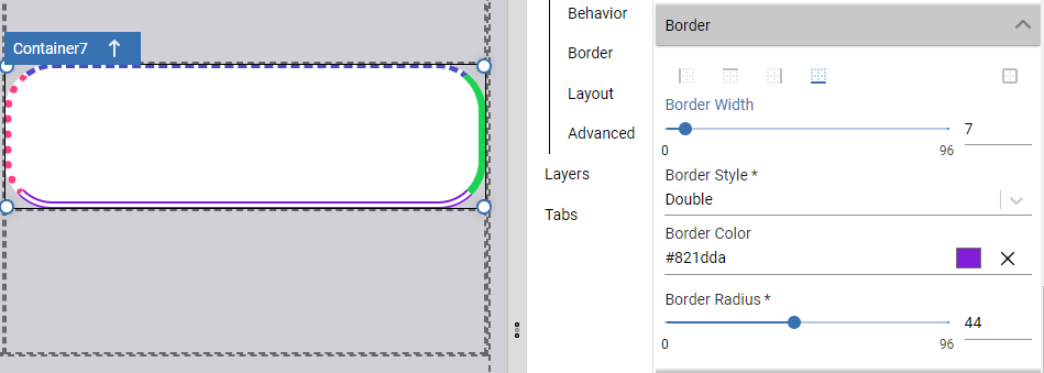
The March 2024 release also includes a number of new element configuration properties, making existing elements more versatile. Text Display Element: First up, the Text Display element has five new properties to configure layout, font size, and font color for the label and data. Table Element: Next up, Table elements have several new properties to further disable interactivity for tables, which is useful in some scre…
A Text element with new size, color, and layout properties setA container with different borders configured for each edge
Screens and User Experience
Login Error Debugging Information
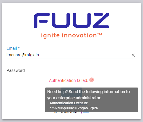
In addition to the new and improved screen elements, the 2024.3.0 release also includes an improvement to the login screen and process specifically aimed at helping administrators when their users encounter issues while logging in. When a user fails to successfully log in, that user can now hover over a question mark next to the error message to view more information. In addition to some error-specific information, t…
Login page with additional error information
Edge and Gateway
New
Added additional error handling around status update calls to catch edge case crashesIntegration Team › Edge Gateway
Orchestration and Data Flows
New
Added "Module Not In List" filter to Data Flows tableOrchestration Team › Data Flow Designer
Improved
Updated to verify message size to prevent attempts to write excessively large log messages to the databaseOrchestration Team › Log Capture
Updated Input Schema and Output Schema sections in Saved Transform Editor to use new Schema Builder inputOrchestration Team › Scripting Language
Security and Administration
New
Added help icon tooltip to communicate additional login error information, such as authentication event ID, to help administrators debug potential issuesData Team › Security
Added Application Development tenant type to build environmentsData Team › Security
Improved
Temporarily reverted change preventing access control policy modifications on custom tenantsData Team › Security
Updated error message for administrative actions to clarify that users need to switch to the administration tenantData Team › Security
Fixed
Fixed several edge case bugs causing incorrect error messages to return during authenticationData Team › Security
Data Models and API
New
Added integration tests for default sequence values, required fields, unique fields, and unique required fieldsData Team › Schema Designer
Improved
Updated service state rehydration to more efficiently filter models to reduce startup memory consumptionData Team › Data Change Capture
App Building and Packages
New
Added a skeleton loading UI while navigation panel is loadingUser Interface Team › Application Designer
Screens and User Experience
New
Added a Button Group screen element which visually groups buttons togetherUser Interface Team › Screen Designer
Added a Split Button screen element, supporting a hybrid button/action menuUser Interface Team › Screen Designer
Added Resizable Panel screen element which creates a user-resizable panel in screensUser Interface Team › Screen Designer
Added Disable Dragging To Reorder Columns property to tables to prevent dragging to reorder columnsUser Interface Team › Screen Designer
Added Disable Dragging To Hide Columns property to tables to prevent dragging to hide columnsUser Interface Team › Screen Designer
Added Hide Table Header property to tables to hide column headersUser Interface Team › Screen Designer
Added border configuration properties to container elementsUser Interface Team › Screen Designer
Added Justify Content , Label Font Size , Label Font Color , Data Font Size , and Data Font Color properties to display text elementUser Interface Team › Screen Designer
Added Disable Hover Effect and Disable Ripple Effect properties to Action Button elementUser Interface Team › Screen Designer
Added "required" validation error message and visual display to icon picker inputUser Interface Team › Components
Improved
Updated to latest favicons library versionUser Interface Team › Framework
Updated scroll behavior to ensure consistent padding around screen contentsUser Interface Team › Framework
Updated role menu behavior to correctly utilize menu icon and title properties in the sidebarUser Interface Team › Framework
Restructured layout to group all designer panels under tabs on the right hand side of the screenUser Interface Team › Screen Designer
Updated auto-save feature to not save when screen is deployed, and to display a green checkmark on the save icon instead of snackbar on successful saveUser Interface Team › Screen Designer
Fixed
Corrected a bug causing data transforms on form inputs to behave inconsistently after initial form data loadUser Interface Team › Framework
Corrected a bug that could cause inconsistent tab width for vertical tab bar elementsUser Interface Team › Screen Designer
Fixed a bug causing the cron visual builder to not output a cron stringUser Interface Team › Components